Context
The task given to our project group was to enhance a current system that we encounter in our everyday lives. After brainstorming sessions we finally decided upon a topic: the Drive-Thru. According to various studies, the Drive-Thru of American fast-food restaurants has gotten slower over time.
The goal of this Human Centered Design project was to design a way to make the Drive-Thru more efficient and customer friendly. Over the course of 10 weeks we went through the iterative design process many times, creating lo-fidelity prototypes and even a scale model. I acted as a UX researcher and UX designer during this project, along with John Yoon, Jiashi Feng, Cecile Pham, Lixiang Zhou.
Data Collection
In the US, the drive-thru is a widely used service provided mostly by fast food restaurants, which helps people get their food faster without leaving their vehicle. Many customers struggle to get the correct order due to various issues during the process of drive-thru ordering. Drive-thru should be a human-centered system which ought to make process of order accessible for both orderer and order taker (primary stakeholders).
Stakeholders
The primary stakeholders addressed by this project is the entire population of people who have ordered fast food via a drive-thru. This includes both the individuals in the driver’s seat, as well as the other passengers of the car. Our secondary stakeholders is the population of ‘order takers’ (i.e. the workers who receive and process drive thru orders).
Observation
For this project we observed customers as they went through the Drive-thru process, from outside and inside their cars. During these observations we took notes on their behavior and experience while also making sure to not disrupt their natural process.
Interviews
In addition to unobtrusive observations we also conducted guided interviews with orderers as they made their way through the drive-thru. We asked them to explain their thought process and feelings during these interviews and also asked questions to gain insight upon their behavior (e.g. “How did you decide what to order?”).
Survey
Our group created a survey via Google Forms to collect responses from stakeholders. The survey’s questions were generated by consolidating some of the unplanned interview questions that had been asked during prior in-person interviews. This survey was made available on the class Piazza page, as well as on the “/r/UCSD” subreddit. Survey responses were made anonymous and coded from the corresponding Google Sheet for use in the affinity diagramming process.
In the survey, we first asked how many times the person had been to a drive-thru in the past year. This question could give us an idea of whether this person is a regular drive-thru customer or a casual one. The two groups could show different customer behavior in drive-thru, and thus their experience of drive-thru could as well be different. Then, we asked the person to share two drive-thru experience of their choice. The name of the restaurant, overall rating of the experience, what stage during the drive-thru did the person encounter any problems, and details of the problem were collected. At the end of the survey, we asked whether they had any other comments on the drive-thru, the survey itself, or our group.
Secondary Research
We also incorporated the takeaways of the QSR Drive Thru Performance Study (2016 and 2017) into our considerations. The studies, conducted by SeeLevel HX (a UX research company), used data from over 2,000 visits to fast food chain restaurants nationwide at various times of the day. It took into account potential confounds – for example, the use of different forms of payment was controlled for by only paying with cash. The study recorded a variety of attributes such as the presence of an OCB (order confirmation board), number of drive-thru lanes, speed of service, etc.
The secondary research helped identify additional elements of the drive-thru affecting performance in terms of speed and user satisfaction. This compensated for our relatively small sample size by providing us with insight into potential issues not captured thus far.
Affinity Diagram
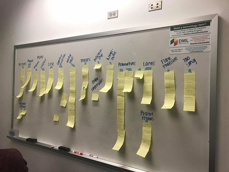
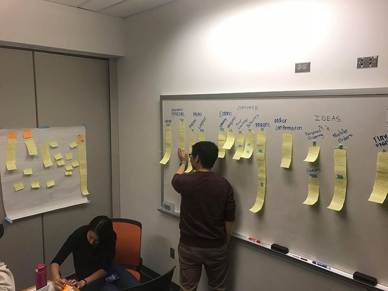
During two meeting sessions, we transcribed data from interviews, survey and observation from digital form to sticky notes. Initially, we grouped them into 16 groups, and we had to discard some nonessential feedbacks (e.g, “they were racist” “Inequality”). Data were grouped by to the key issues they mentioned. Then, we merged similar categories into one category, divided one big group into multiple subcategories (e.g. ‘Communication’ into ‘Interpersonal’ and ‘Physical Limitations’, Menu into Physical and Layout). Additionally, since we scoped down our topic area from the whole process of drive-thru to the Ordering stage, we put aside one category which is “Worker Error”.
The final Affinity Diagram is divided into following categories/subcategories:
Too long : “I spend too much time waiting”
Order Confirmation: “I have no way of confirming my order”
Time Pressure: “I feel pressure to order faster.”
Menu: “I use the menu to select items for my order”
— Physical: “I can’t see the menu itself well.”
— Layout: “I feel the menu does not properly present available items”
Physical Aspects: “I use physical aspects of the drive-thru to guide my behavior.”
— Drive-thru: “I use physical indicators to navigate into the drive-thru.”
— Lanes: “I use physical cues from the drive-thru layout to navigate.”
Communication: “I am communicating with the order-taker”
— Interpersonal: “I can’t hear the order-taker well and they can’t hear me either.”
— Physical Limitation: “I have to lean closer to the microphone.”
Reason: “I want to go to the drive-thru because…”
Knowledge: “I have prior knowledge of the drive-thru.”
Customer Behavior: “I act a certain way.”
Alternative: “I use alternative methods to order food.”
— Mobile Orders: “I use/don’t use mobile orders.”
— Personal Ordering: “Order taker walk up to my car to take order.”
Opinions: “I think that…”
Pain Points
From our data collection and affinity diagrams we were able to narrow down the main pain points that stakeholders experience during the Drive-thru process.
- Technical Issues – Some of the technology found at drive-thrus can be faulty and unreliable, which can result in miscommunication between the orderer and the order-taker.
- Physical issues – The lanes are too small to be able to navigate through drive-thrus easily. The distance between the car and window can also be troublesome if people don’t drive close enough or if they just can’t reach due to their heights.
- Human issues – There are often communication problems between the orderer and order-taker. Some of the factors that cause this problem include machine problems, speaking rates of the order or order-taker, accents, and volume.
- Time pressure – Orderers often feel pressured to quickly pick what they want to order because there may be a line of cars behind them or they don’t want the order-taker to wait too long.
- Ordering life cycle (order-pay-pickup) – The general order of the drive-thru is order, pay, and pick up, however some orderers may not be fully satisfied with this process. Some may want to order and pay at the same time, or alternately they may want to order online and just go to the drive-thru to pick up their order.
Ideation
Personas
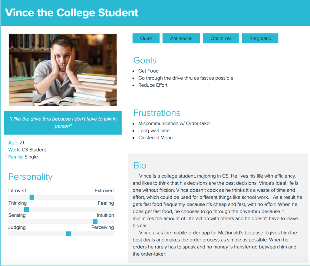
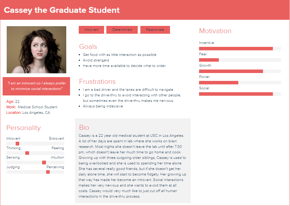
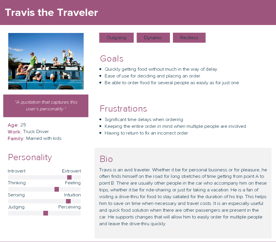
Below are some personas that our group created (I created the first one).
Design Solutions
Our three main potential design ideas are the redesigning of the:
—Lanes
—Physical Layout
—Menu
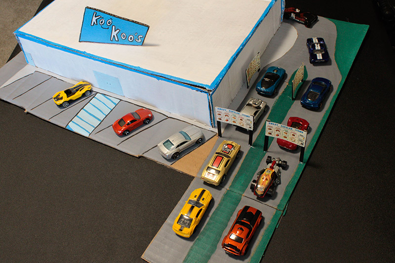
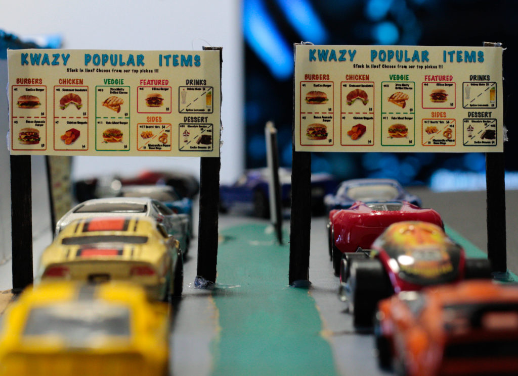
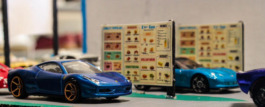
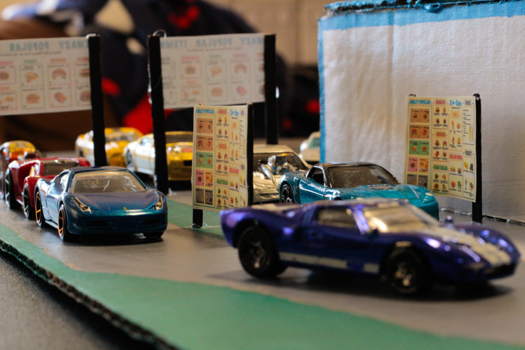
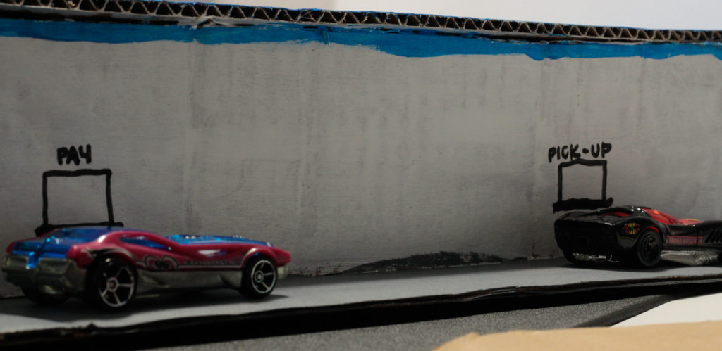
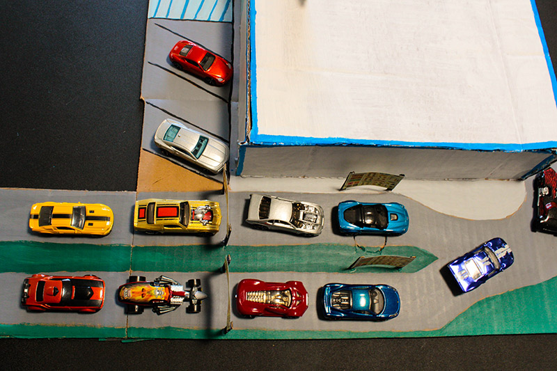
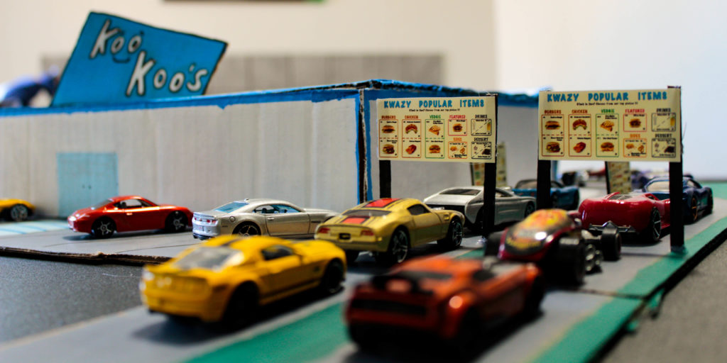
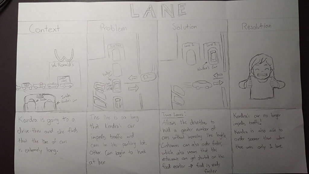
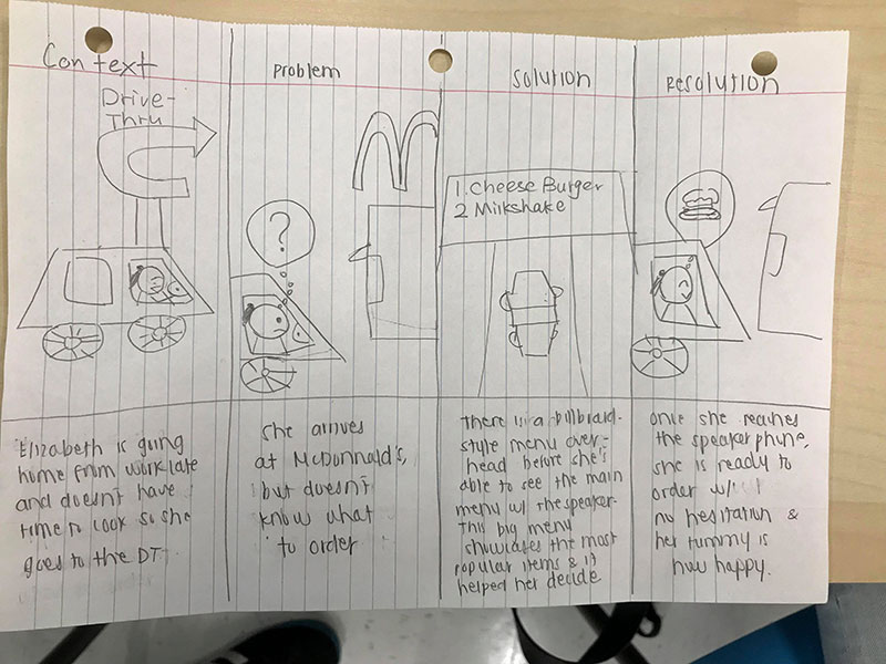
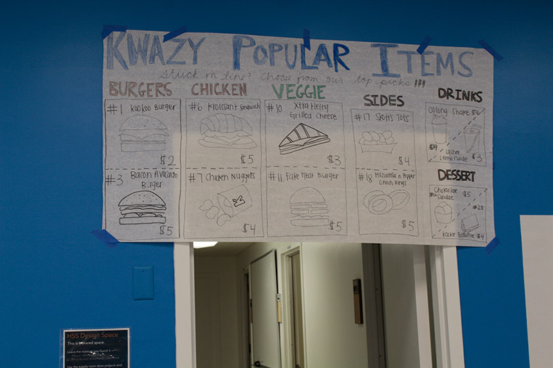
For the lanes, we came up with the idea of having two separate lanes for two different purposes. The lane that hugs the restaurant’s building would be the regular or “leisure” lane. This lane would be meant for people who are in no hurry and who don’t know what to order and need a longer look at the menu. The customers would order using an interactive interface, which would also have a help button in case customers want to speak or order through a real person. Meanwhile, the express lane would be the one closest to the street since it’s meant to go faster which would avoid any traffic going beyond the fast food establishment. For the physical layout of the drive-thru, we wanted to have two lanes which would merge to the pay and pick-up windows. To avoid confusion, we would also add a stoplight that would inform cars from each lane when to move forward. Finally, we wanted to have two menus displayed. One would be the “pre-menu” which would be placed a few cars behind the speakerphone and above the whole drive-thru. It would essentially only display the most popular items (determined by rating or volume), so this menu would be less clustered and confusing. The second menu would be more extensive and specific and would be placed by the speakerphones.
Our process of coming up with design ideas was iterative. We first coded all of our interviews which we then grouped in our affinity diagram. The process of making the affinity diagram helped us realize the main concerns of our interviewees, especially from repetitions. We then based our potential design solutions from the main patterns seen in our affinity diagram which were the time wait, order confirmation, time pressure, menu, and communication. We went through each category of the diagram and threw out whatever idea we had to fix that particular problem. The most feasible and advantageous ones stuck, while the ones who would do very little benefit were thrown out.
Our design ideas essentially address the problems of the lanes, physical layout, and the menu. Our goal is to have customers be able to navigate the drive-thru as quickly and easily as possible. We minimized the amount of traffic around the establishment and we took into consideration how some people need time to decide what they want versus customers who already know what they want. We also want to avoid the confusion expressed by our interviewees as to when they are supposed to move forward when two order lanes are merging. The green and red light would give explicit directions since the driver would already accustomed to stoplights. Finally having two separate menus addresses both ends of the spectrum we saw interviewees had about the menu. There would be a cleaner and more organized menu for the people who preferred less items displayed and there would be a more extensive menu for those who want to see more or all the choices the restaurant has to offer. We decided not to design any solutions for the order confirmation problem because this can be solved by the order-taker being more specific (or being better at their job) at the pick-up window, which is out of our hands and out-of-scope for our project.
Potential roadblocks included creating a working prototype and being able to simulate the newly designed drive-thru space. Since these are such big scale changes in privately owned places, it would be too difficult for us to actually implement our ideas at any drive-thrus. It would also be difficult to have our stakeholders test our ideas since our prototypes are likely not to be portable either. However, one way to overcome these would be to simulate driving with a wheeled chair or such. We could also have all our prototypes in one place and have stakeholders come and test them out, or depending on how realistic we make our prototypes, we can also have them be portable and bring them to our stakeholders themselves.

Storyboards
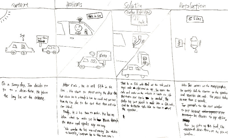
These storyboards were created during our ideation phase to visualize the context and the solution. I personally did not make any of these.
Prototyping
Lo-fidelity Prototypes
We created these lo-fidelity prototypes to help us plan our user-testing process.
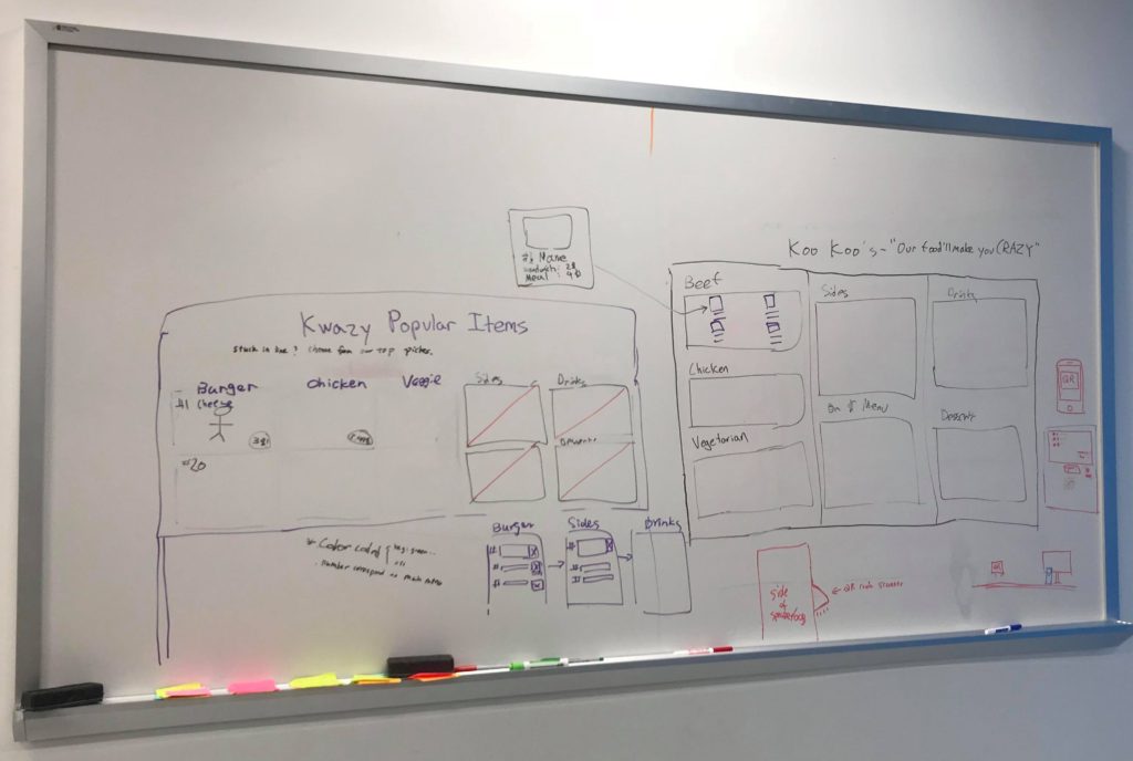
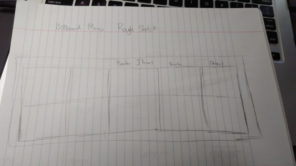
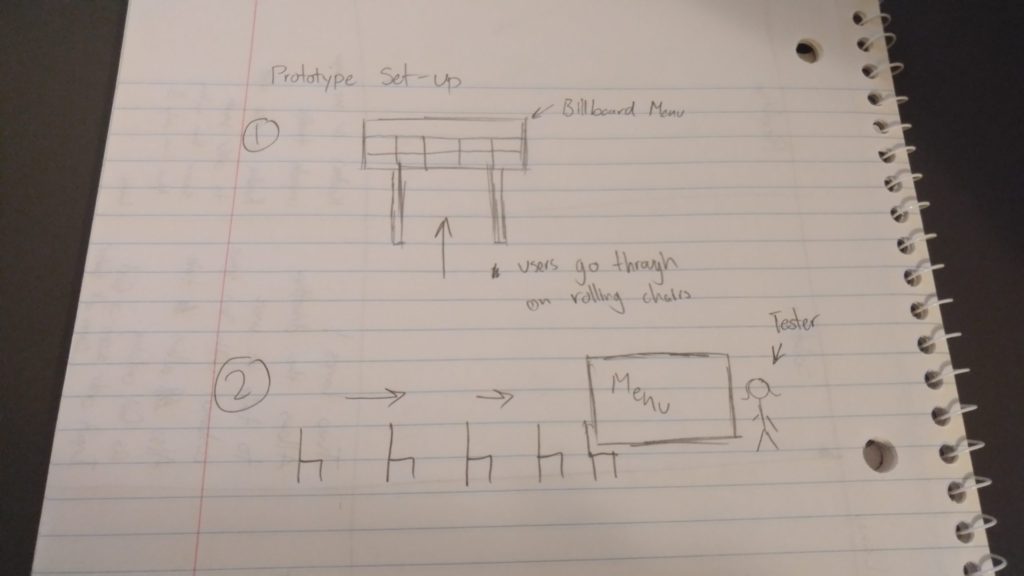
User Testing
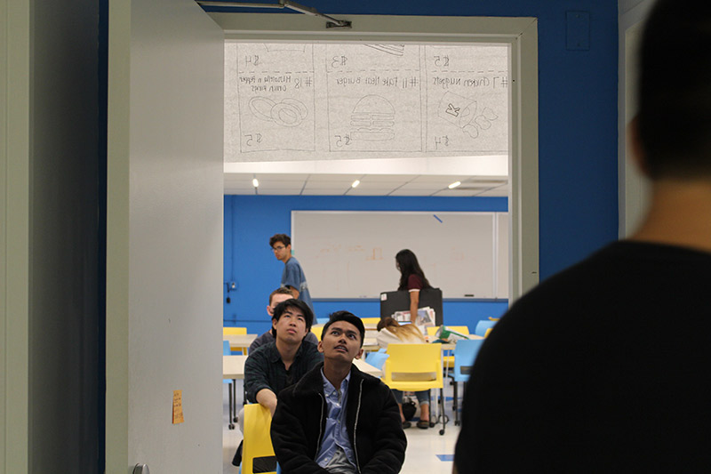
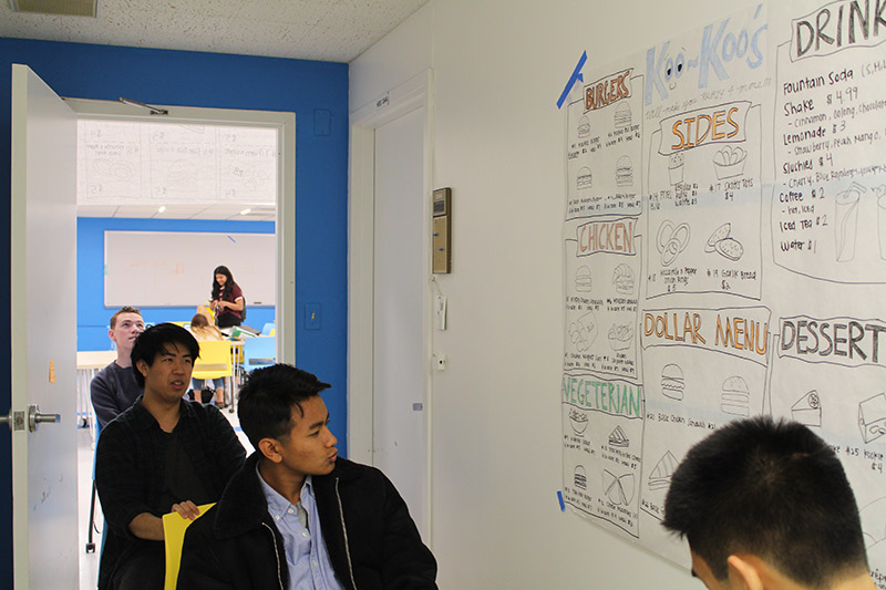
In order to simulate a drive thru experience we used rolling chairs and a hallway where we hung out menu. We had our participants sit in these chairs as if they were driving to order food. One of our group members, acted as the speaker/digital display that your order from.
In the first round of testing we had our participants go through the drive thru and noticed that they didn’t know what to order because they could not see the menu clearly until they were directly in front of it.
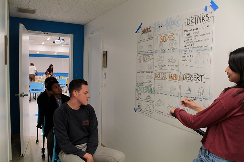
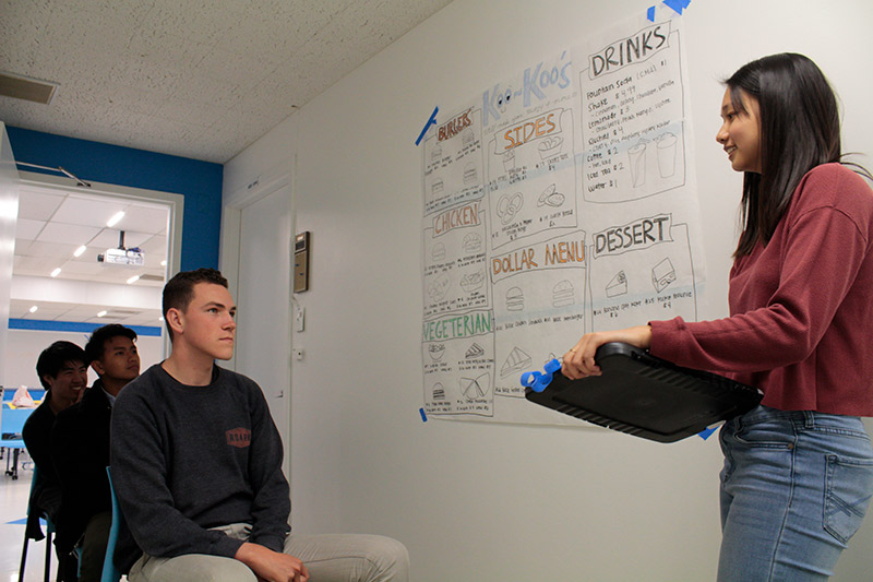
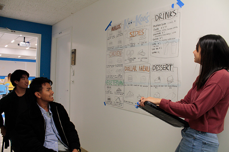
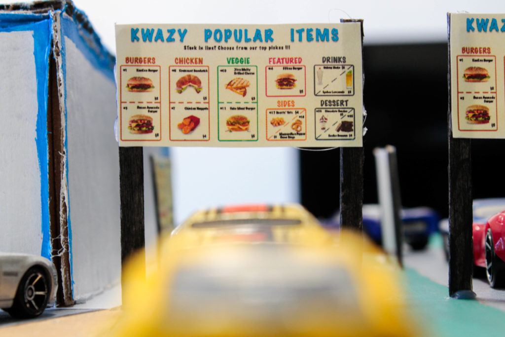
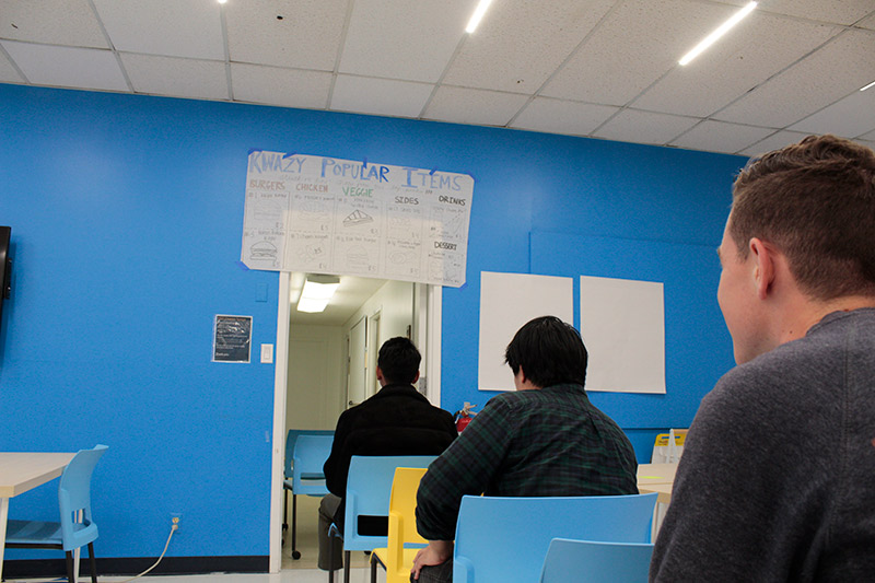
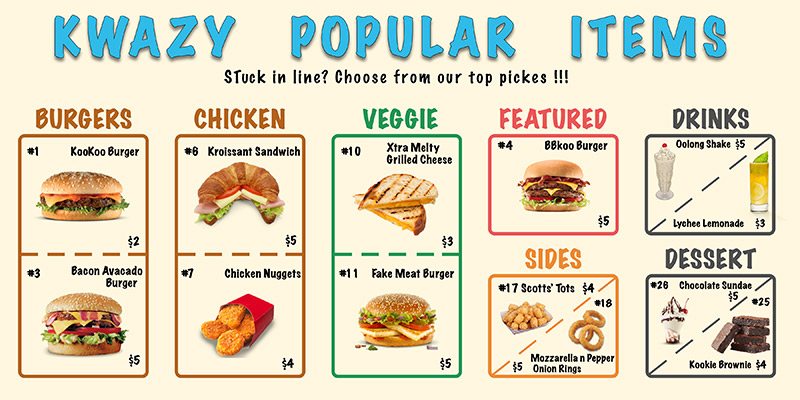
In the second round of testing we added our proposed billboard menu to show highlighted items while customers were waiting in line, making the decision of their order less stressful. Participants in the very back of the line were also able to see menu items while they were waiting to advance.
Digital Mockups
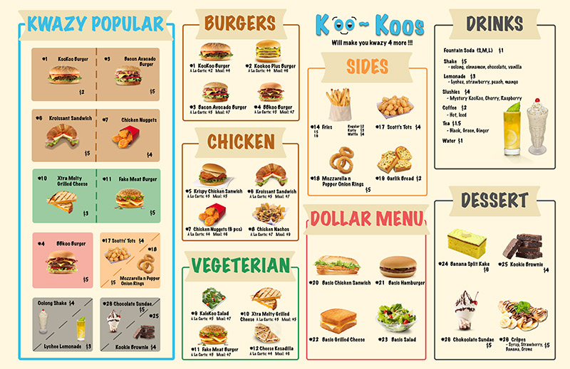
Satisfied with our user testing findings, we decided to make digital mockups of the menus we used so that we could use them for our final prototype.
Final Product
Using our findings we created a small scale model of our ideal drive-thru setup using cardboard, paint, Hot Wheels, and small printings of our digital menus.
